
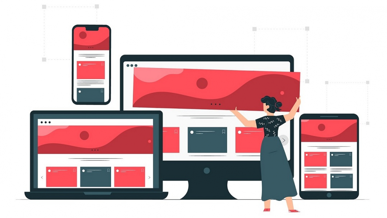
What is responsive web design for website?
Responsive web design refers to a type of web design method in which a webpage automatically adjusts itself to the screen it is being displayed at, in simple terms, it is an intelligent design that makes a webpage comply to user’s device in order to facilitate the best web experience.
Why does it matter?
Prior to the mobile device era, users used to access the web through desktop computers only. Almost every monitor had a similar screen size. As a result, websites were designed accordingly, without the intelligence of adaptability. However, today we have all sorts of screen sizes when accessing a website, from a feature phone with a 3″ screen to huge 80″ TVs. Therefor, any website would fail to serve its purpose if it lacks adaptability.
On the other hand, within the same screen size, different OS users expect certain features. For instance, iPhone users are accustomed to being able to swipe left/right/up/down. While visiting a webpage smartphone users expect to click a phone number and have it on their dial pad automatically. Similarly, they expect an address to have a direction button that will use their phones GPS app to guide them.
This is so important, because mobile device users continue to trend upwards. Links from social media cause huge traffic to websites in general. Not only mobile device users, it is also relevant to desktop users who might be using a split screen view or a condensed desktop browser.
What is a non-responsive website?
In simple terms, a non-responsive webpage can not do any of the things mentioned above. Imagine using a desktop webpage on a small smartphone; users would have to zoom and swipe all over the webpage to get an idea about the page. In contrast, with responsive design users do not have to worry about that. Rather, the webpage is coded to automatically adapt to your specific screen size.
Why do you need a responsive website?
Responsive design is the default these days. It is no longer a feature that is nice-to-have. Users take it for granted. Additionally, creating responsive webpage is both easier and more beneficial at the same time. It definitely improves user experience, is much easier to handle, cheaper in terms of maintenance costs, and on top of that it helps your website rank higher when it comes to SEO.

Here are some statistics to help you understand the importance of responsive web design further more
- Poorly designed websites make you lose recommendations by up to 57%
- As high as 85% of users expect corporate websites to be as good if not better, when viewed on a mobile device.
- A company’s credibility is judged by 75% of consumers on its website design.
- 46% of consumers base their decisions on the credibility of the website they visit.
- 80% of consumers stop engaging with a website content if it does not follow their device.
- Seamless web experience is very important to 83% of mobile users that use other devices too.
- 88% of consumers visit or call businesses within 24 hours of searching for it online.
Follow us on